Making your (digital) life more enjoyable

That's what I love to do.

Welcome at Menjar

About
Hi! I'm Menno.
I'm an enthusiastic and curious User Experience and Service Designer with a unique view on problems. Especially on the closing experience. I enjoy helping people.

"Make users smile whilst using their devices. That's what I work for every day"

I love to design and invent things, especially when I know that people will be helped by things that I design. I love to work with people in the real world. Visiting users, interviewing or shadowing them make me happy! I love presenting, especially with a great Keynote and awesome thing to talk about. I like to know how things work. I am positive and like to motivate people. I don't like to sit whole days behind my desk — rather I'd jump in a ball pit and be creative.

Vision: As a designer, I love to create things that help people. Often, anything digital is part of a solution, which can be awesome and beneficial. However, I want to assure that we're not turning into phone/digital zombies with things that I design. I want to contribute to the conscious use of technology.

Masters: In the summer of 2019 I graduated with distinction for the two-year Master programme in Design at Linköping University (Sweden), with a focus on Transformative Service Design. I developed service concepts and social innovations to facilitate the transformation of practices and used co-creation to create value. I extensively researched the closing of an experience.

Bachelors: After graduating from Gymnasium in 2012 I started studying Communication & Multimedia Design at The Hague University. Core themes were Visual, Interaction and User Experience Design. I also worked on communication strategies and developing in HTML/CSS/JS[jQ].
The leading Dutch digital agency Tam Tam (part of DEPT) offered me an internship where I improved my visual, conceptual and interaction design skills. In my third year I did an exchange semester at Stuttgart Media University, Germany, where I focused on brand experience, marketing and creating concepts. In 2016 I graduated in The Netherlands with a project for which I created a user-friendly platform to find complex measurement data from smart-city sensors.

Awards & highlights: During my first year I won an expert jury prize for the best online portfolio of all first year students. I also passed my propaedeutic year with distinction.
In 2015 I was selected to participate in the national talent programme for Digital Design Students, organised by the leading sector association Dutch Digital Agencies (DDA). I trained my skills in multidisciplinary team work, creativity and (disruptive) service design within this programme.

How to make me happy
Cycling Longboarding Keyboard Couchsurfing
Skiing Photography Travelling Designing
NO templates. Blegh.
How I (try to) make you happy
Sketch (Pro) Keynote (Pro) Lightroom (ok) Brackets (ok)
HTML/CSS/JS

Projects
All well considered.
I have worked with pleasure on projects at work, for clients, university and myself. A selection of most memorable projects is displayed below. Will you be part of my next project?
project Air France - KLM Online Check-in icon KLM
Air France–KLM Online Check-in
Concept, UX & Service Design
Air France–KLM Online Check-in
Concept, UX & Service Design

Preparing the trip for over 1,5 million passengers per month.

Introduction to the project Being responsible for the online check-in means taking care of around 1.500.000 passengers per month checking in for their flights on Air France and KLM. A complex product featuring an unimaginable amount of scenarios. Scenarios that include entering a passport or visa, passengers travelling as unaccompanied minor, or passengers that (partially) saved their details in their online profile. All those tasks seem complex and time-consuming, but according to our data, we did a great job in making the online check-in a user-friendly process.

Besides the check-in functionality, we also support passengers who need to rebook their flight due to misconnections or cancellations, or because their fare allows them to do so. That functionality I'd like to highlight here.

In the rebooking-scenario, users have to rebook (one of) their flights. Some of them have been informed that they need to do so; others are surprised that their flight is disrupted once they land on the check-in. To comfort them, we offer our assistance, and show a direct solution: an overview of the available flights. Their original flight is shown to make a comparison with new flights easier. By displaying boarding time, we help users to understand if they can make the new flight. If the return flight needs to be rebooked as well, the same features are in place.

An overview of selected flights is then presented. I added the 'time in between flights' here, especially for passengers who fly a same-day-return. It gives them an easy overview if they will have sufficient time at their destination (e.g. 5 hours) before their return flight will depart.

Process: behind the scenes The creation of the rebooking-scenario followed a typical process that you would encounter at Air France - KLM (yes, we design both for AF and KLM ). Working in a feature/scrum team, the analyst, P.O. and me (UX) were introduced to this topic by the customer experience department. Refinements were organised to get more knowledgable in the project, technical possibilities and limitations were discussed.

With all information and goals known, I created the design for this new user flow. I added features that would come in handy for passengers, and collaborated with another UX designer who is responsible for the airport-kiosk check-in. This way, we generate consistency. Everything we design is for both mobile and desktop, and accessibility is also important. Accessibility isn't about adopting for certain users –it's about making things easier for everyone. Throughout the design process, the usage of a Design Library/System and the existence of a UX Team for all Air France's and KLM's products contribute to reaching the next level.

A design proposal was made, and checked with the feature team. Testing the product 'in the field' was the next step. It's always fun to do: will my goals be understood by users – and what is their perception? Together with the airport-kiosk designer, we conducted a test at the KLM Crown Lounge at Schiphol Airport. We introduced a scenario in which the passenger would have a same-day-return flight, and tested our prototypes on desktop and mobile. The users went smooth through our test – and liked the proposed features. Some remarks were noted. Some elements we could directly fix in the prototype – others were changed in the iterated product.

Being content from a UX perspective, and having the topic planned in the PI, the team could start building. For me, it meant doing visual checks on the progress that was made – and adapting to unforeseen technical limitations (yes, digital airline-systems are complex). Finally, we could go live and see the results of the new product. It increased customer-happiness, and decreased calls to the callcentre. The end? No, we'll keep monitoring the product, and adapt if needed.

project First portfolio website icoon First Portfoliowebsite
Air France–KLM Online Profile
Concept, UX & Service Design
Air France–KLM Online Profile
Concept, UX & Service Design

Managing your loyalty status, contact details and vouchers in an easy way.

Introduction to the project Being the central place to follow your frequent-flyer loyalty status, manage your details or travel documents, the Air France - KLM profile pages are built for many purposes. I would like to highlight two particular pages: the vouchers-page, and newsletter-subscription process.

The vouchers page was planned to be built already before the CoViD-19 pandemic. It was slightly postponed due to technical dependencies from other teams and airline systems. Vouchers were distributed to passengers in case of (in)voluntary downgrades, service gestures, cancellations, etc. We wanted to create a central place for passengers to see their vouchers, and help them to find a good spending way. In the design, I made a distinction between active vouchers and past vouchers. I displayed an expiry date (which needed to be calculated), and a connected status. If the voucher would expire soon, it would display text in red 'expiring soon', to raise more attention. As an MVP, we agreed that there wouldn't be any functionalities here – merely displaying information. The functionalities would be built in the check-out, where users could select their voucher.
Due to the CoViD-19 pandemic, building the vouchers page gained momentum. An unimaginable amount of vouchers was distributed – so displaying customer's vouchers was very relevant. At great speed, decisions was made to make the voucher page alive, and information regarding specific CoViD-19 vouchers was presented.

The subscription of the newsletter for Air France – KLM is another project I worked on. As a goal, we wanted to increase the number of subscriptions – and give insights in data-purposes. I designed a three-step flow. First, people would enter their email address and decide what newsletter they would like to subscribe to. I designed a container with reassuring information regarding newsletter frequency, data storing, and unsubscribing possibilities. After the first step, people would be subscribed. In a second step, people could extend their data for more relevant newsletters. Besides their name, their date of birth allowed us to send a little gift, and their preferred departure airport a tailored offer. After submitting this data, the subscription was updated. For a nice closing experience, I added a link to the latest newsletter, and a link to the offers page.

Process: behind the scenes The vouchers project was planned for a long time. Working in a feature team, the analyst, PO and me refined the vouchers functionality multiple times with other teams (including business). Due to the CoViD-19 pandemic, creation of the voucher page gained momentum. We had to work around technical limitations (many different airline systems work together in providing vouchers), and under time pressure. It led to not displaying the expiring soon functionality in the first MVP. For the MVP, this was acceptable.

As the vouchers page followed a new structure, intensive collaboration with the UX team took place. A table format was chosen, which would not work on mobile. We reused a component from the design system for the mobile view.

The subscription of the newsletter was a topic where many departments were involved in (marketing, customer experience, etc.). Six meetings were held, where through service design techniques, a mutual vision for the newsletter was created. It also helps in the adoption – as everyone had contributed. Multiple designs were created, and tested with the teams. Many adoptions were requested by different departments – all being back at their vision. We went back to the defined problems, and how the designs could solve them.

project Coachgezocht.nu icon Coachgezocht.nu
Coachgezocht.nu
Concept, UX & Design
Coachgezocht.nu
Concept, UX & Design

The first user-centred online platform to find your suitable coach in The Netherlands.

Introducing Coachgezocht.nu Meeting your perfect coach online was difficult in The Netherlands. Neither did a central place to search exist, nor were qualifications of a specific coach available. Coachgezocht.nu solved both problems.

A suitable coach is found by selecting for whom the user is searching a coach, and the dilemma the user is facing. The list of found coaches allows a specification based on personal life-changing characteristics, e.g. being married, having children or being religious. I introduced this feature as research shows a higher succes rate of coaching sessions with a coach and coachee sharing common life styles. Profiles of coaches show introductions in their lives, professional career and qualifications. Additionally, a typical coach session with the specific coach is described as coaching is often experienced as ambiguous.

The concept was based on the ambiguity of coaching and designed user-centred. Wherever uncertainties about coaching could be experienced, content to provide a clear and understandable story to the user was designed. The user-centred design is reflected in the lack of coaching-specific terminology, but presence of easily understandable content.
The process behind Coachgezocht.nu An investor approached me with his idea of bringing coaches and coachees together. I wasn't familiar with coaching, so researched the field of coaching. I read articles, experiences and conducted interviews under both coaches and coachees. This was very useful, as the target group turned out to be different than expected at first by the client. After this introduction to coaching, I conducted further research on online meet&match platforms.

Based on my research, I started sketching. Several sketches led to a concept and low-fidelity prototype, which were presented to the client. After approval, this low-fidelity prototype was further developed into an interactive high-fidelity prototype. A last user test indicated minor improvements, and led to the coding of the website. The website was coded by a trusted partner, and is currently live. Coachgezocht.nu has resulted in numerous successful matches and coaching sessions.

What the customer says...

Jarwa Webdesign (Menno) designed a website for me which I'm very proud of, and receive a lot of compliments about. The reason for me to work with him was his creativity and attention to details. Those are, in my opinion, aspects you can only learn limited. Those skills are present naturally by Menno.
In our collaboration, I also noticed his commitment and how he can be resolute. It often seems that Menno already has a certain idea in which direction the design has to go, and can talk about that idea with a lot of passion. Since I don't have a design background, it was great to drop my ideas with him, so that he could create a vision in which direction the design should go.
With his involvement, Menno also shows a lot of initiative, and is focused on a high quality result. He's not afraid to do the work for that. He, for example, started to search for future users for my website to get more feeling with the target audience.

Sander Goethals
SPMG Web Services B.V.
project Food Save! icon Food Save!
FoodSave
Concept, UX & Design
FoodSave
Concept, UX & Design

We need to reduce the amount of food waste. Help is here!

Introducing FoodSave One third of all food worldwide is spilled. An insane amount regarding the amount of people that suffer from hunger. FoodSave helps people to reduce their food waste by helping to choose the right state of products in stores, and by determining if a product is still edible.

Both in-store and at home people are assisted in their choices of buying, storing and using produce. In-store, information is available about the risk of spoiling a product, as produce items might be difficult to handle or store. The FoodSave app provides detailed information about three stages: buying, storing and using produce. Whilst buying, products should be bought in different states for different purposes (i.e. ripe bananas for a smoothie today — vs storing them for the week). The second stage, storing, helps people to store the product properly according to their wishes: storing for the best taste, faster ripening, or extending storage life. The last stage, using, helps people to find ways to use the product in its current state.

The Meal Slot offers users to find interesting recipes with items they have at home and need to use soon. Multiple items can be added, and a new turn on the slot handle shows a different recipe.

The process behind FoodSave The urge of acting against the incredible amount of food waste was clear. In the first stage of the project, research was conducted of habits that people had regarding food waste. Literature research showed that the largest reductions of food waste could be achieved in home cooking and supermarket situations — occasions where the customer has a big influence.

Contextual interviews with participants showed the importance of aesthetic properties of produce items, and that food is just stored at home based on assumptions. Sometimes, food was stored wrong which led to unnecessary food waste.

Together with a benchmarking of other products that reduce food waste, a prioritisation was made of elements that would be crucial in the concept. Those were transferred to concepts in a co-creative speed sketching session that led to new insights. The concept was finalised soon after that — and led to a functional prototype that is ready to be tested.


Photography
Part of my life.
I spend a lot of time with my camera, and attended several photography courses to experiment with photography techniques. More photos on: exposure.co, 500px, and Instagram

Jarwa Webdesign
For happy customers.
Ensuring your customers are as enthustiastic about your product or service as you are. More than just visual or webdesign, I also help you with Service Design. From the first contact with your customer to having a positive closing experience: I'll make your product or service memorable!
Concepts
We will discover different concepts to make your wishes come true.
Creation
From websites to service concepts. We'll find out together how we can make your customers the most happy ones in your field.
Development
We found a great idea? Let's make it! Varying from a service to the development of your website.

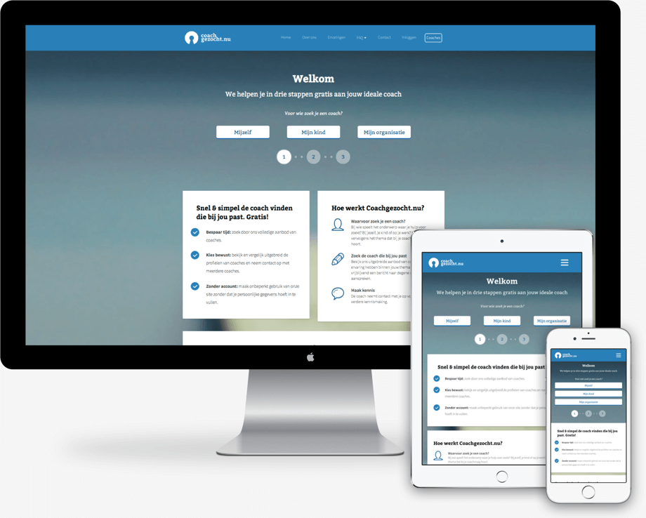
About Jarwa Webdesign
To kickstart the foundation of my own company I attended a master class programme for young entrepreneurs, called "De Zomerondernemer" (The Young Entrepreneur). During this summerschool I participated in masterclasses regarding tax authorities, the chamber of commerce and marketing. I don't like templates, so I don't use them for any customer. I design things 100% by myself.

What the customer says...

Jarwa Webdesign (Menno) designed a website for me which I'm very proud of, and receive a lot of compliments about. The reason for me to work with him was his creativity and attention to details. Those are, in my opinion, aspects you can only learn limited. Those skills are present naturally by Menno.
With his involvement, Menno also shows a lot of initiative, and is focused on a high quality result. He's not afraid to do the work for that. He, for example, started to search for future users for my website to get more feeling with the target audience.

Sander Goethals
SPMG Web Services B.V.

Contact
Always in touch.
Any ideas you would like to talk about? Do you want to meet for a coffee? Or just talk about your life story. I'm happy to listen.
Name

Email

Your story


Or contact / follow me here
Direct mail

Other information
KVK 59334193
Taxes NL002318870B84
Terms & Conditions